STARTTS
Evolving Identity. Preserving Trust.
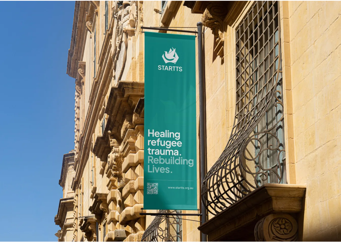
STARTTS approached us to lead a full brand refresh — not a reinvention, but a careful evolution.
As a government-aligned organisation supporting survivors of torture and trauma, trust, credibility, and continuity were essential. The board sought a refined identity that modernised the brand while preserving recognition and institutional confidence.
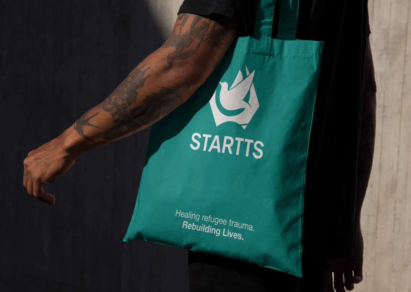
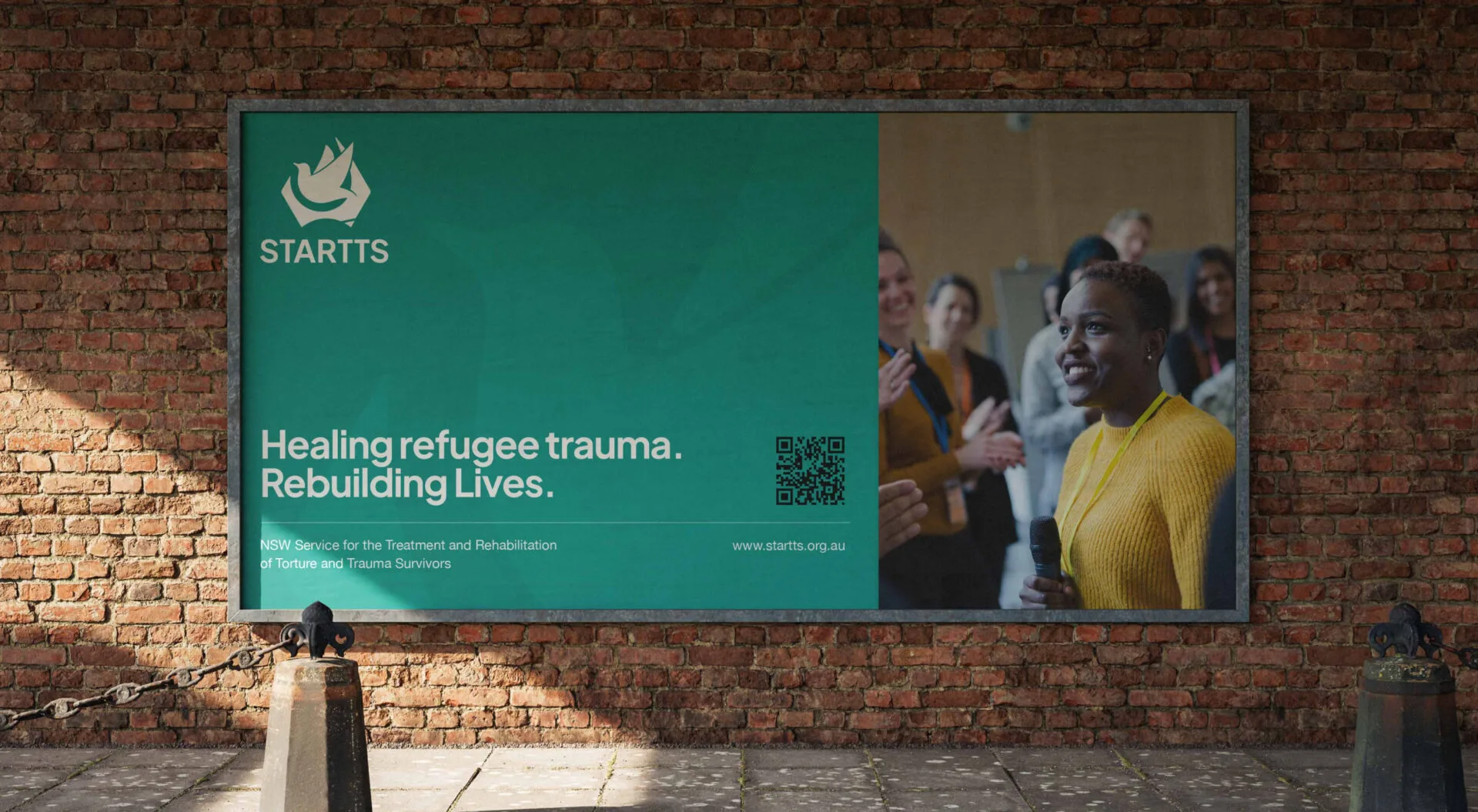
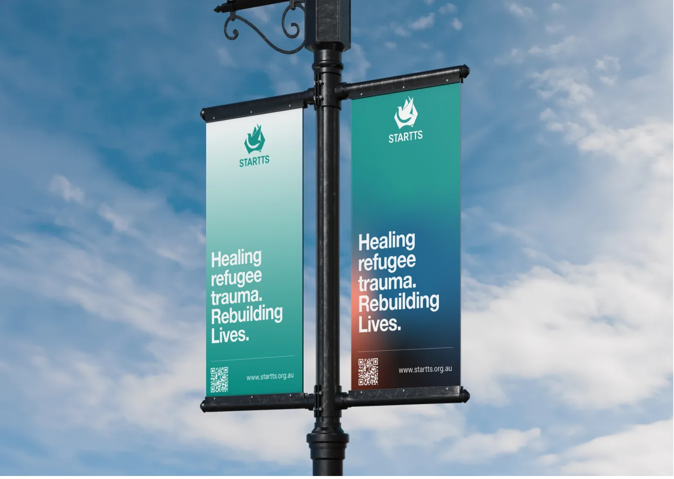
We explored two strategic directions — one more progressive, one more conservative. Ultimately, the chosen path respected the organisation’s legacy while introducing subtle yet meaningful refinements: refined colour balance, enhanced symbol clarity, and a more dynamic dove mark designed to suggest forward motion and hope.
The result was not a dramatic transformation — but a deliberate, thoughtful evolution aligned with the organisation’s mission and stakeholders.

Brand Systems Built for Scale
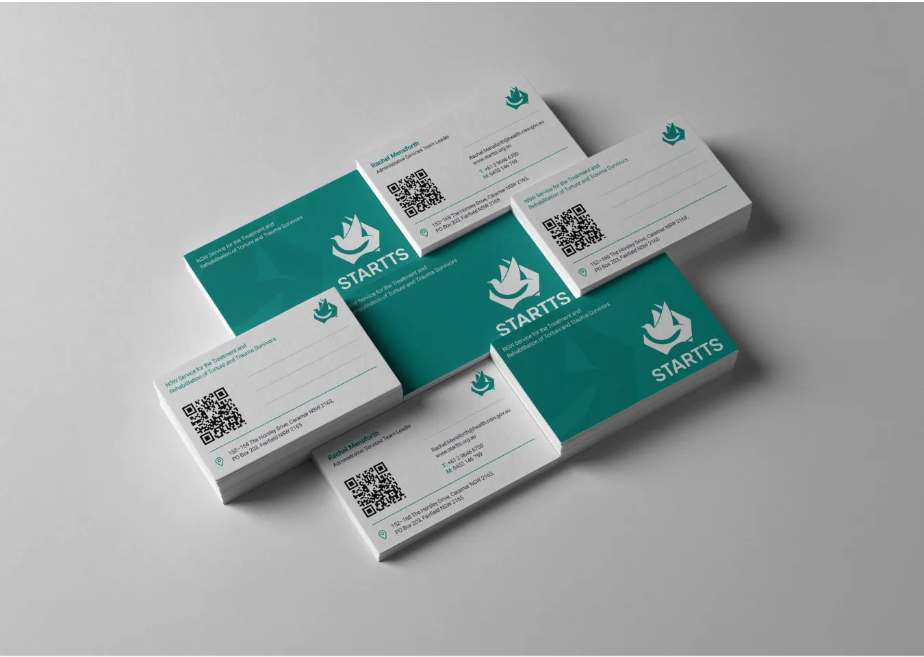
Beyond the logo refresh, the project extended into a comprehensive brand system rollout.
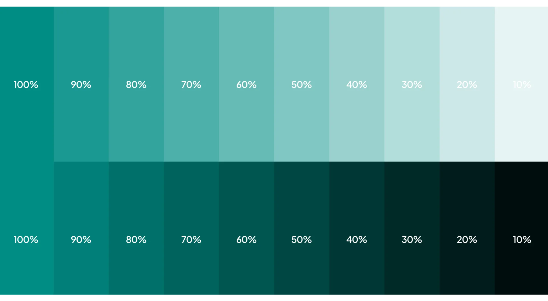
We developed a detailed brand manual structured with clear hierarchies, usage principles, and practical do’s and don’ts to ensure consistency across a large, multi-department organisation. Given STARITS’ scale and public-facing responsibilities, clarity and governance were critical.
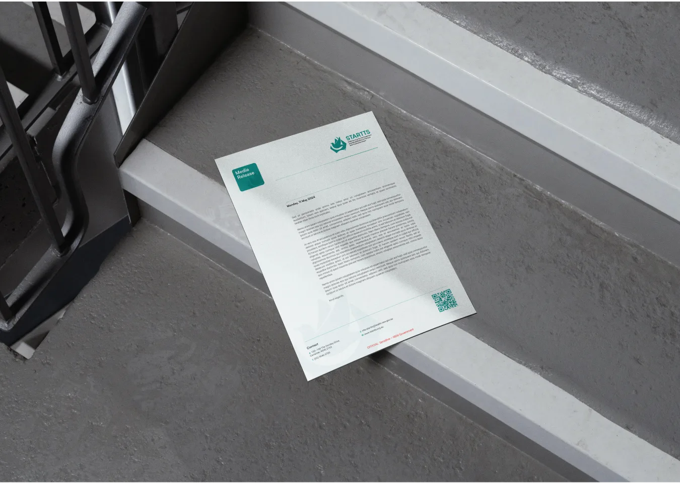
The second phase focused on implementation across key touchpoints — from digital banners and social media templates to email signatures, official documentation, and internal communications.
Rather than delivering isolated design assets, we created a structured visual framework that empowers the organisation to maintain coherence and integrity long after the initial rollout.